library(here)
library(tidyverse)
load(here("puerto_aviles.RData"))Creating a Heat Map for Steel Coils
In this post, we create a heat map to visualize the marine traffic in the port of Avilés for steel coils which are loaded to other destination ports.
In this post I try to create a heat-map using the tidyverse package. The idea is with a heat-map plot to see the marine traffic in the port of Aviles for a certain type of merchandise. So we choose the steel coils (“BOBINAS DE ACERO”) which are loaded in the port of Avilés and are sent to different ports around the World. So let´s start loading the library and looking to the data.
Now we filter the data for the whole year 2024.
puerto_aviles_2024 <- puerto_aviles %>%
filter(`Fecha Entrada` >= "2024-01-01",
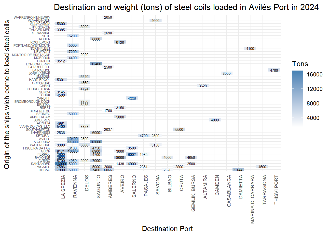
`Fecha Salida` <= "2024-12-31")Now let´s filter the data for the steel coils (“BOBINAS DE ACERO”) and boarding for the type of operation in the port. After, plot the data with the destination ports on the X axis. In the Y axis are the ports of origin of the ships that come to load the steel coils. The size of the square is the weight of the steel coils loaded in tons.
puerto_aviles_2024 %>%
  filter(Mercancia == "BOBINAS DE ACERO", Operación == "Embarque") %>%
  mutate(
    Pais_dest = fct_infreq(Pais_dest),
    Pais_orig = fct_infreq(Pais_orig)
  ) %>%
  ggplot(aes(Pais_dest, Pais_orig, fill = Tonelaje)) +
  geom_tile() +
  scale_fill_gradient(low = "white", high = "steelblue") +
  theme_minimal() +
  theme(axis.text.x = element_text(angle = 90, hjust = 1))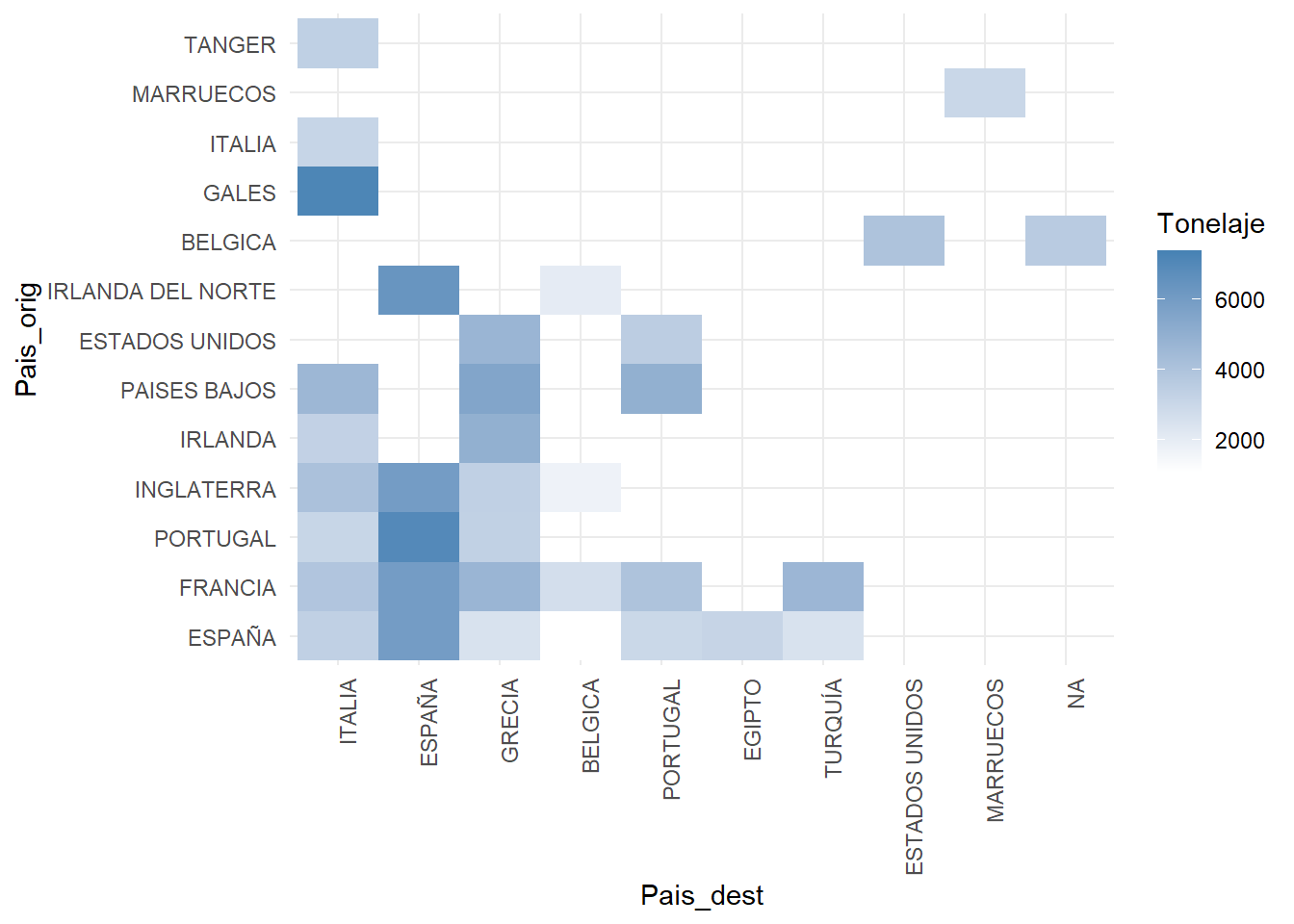
We use the fct_infreq function to order the countries by the number of trips. We can see that the most frequent destination is Italy, followed by Spain and Greece.
Let´s use the cities indeed the countries and we fill the squares with the weight value in Tons.
puerto_aviles_2024 %>%
  filter(Mercancia == "BOBINAS DE ACERO", Operación == "Embarque") %>%
  mutate(
    Destino = fct_infreq(Destino),
    Origen = fct_infreq(Origen)
  ) %>%
  ggplot(aes(Destino, Origen, fill = Tonelaje)) +
  geom_tile() +
  scale_fill_gradient(low = "white", high = "steelblue") +
  theme_minimal() +
  theme(axis.text.y = element_text(size = 5), axis.text.x = element_text(angle = 90, size = 7, hjust = 1))+
  geom_text(aes(label = round(Tonelaje, 1)), size = 2)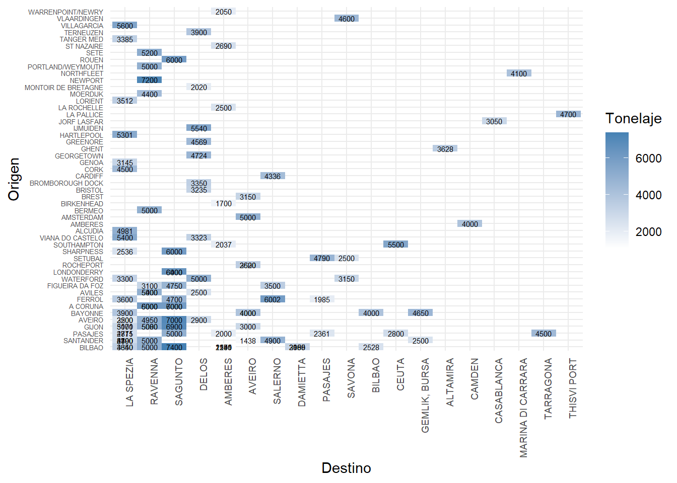
We can see that there are numbers that are overwritten. That is because we have a number (weight) for every ship that has loaded steel coils in the port of Avilés. Let´s take the case of the boats which come from Gijón to load steel coils with destination La Spezia.
puerto_aviles_2024 %>%
  filter(Mercancia == "BOBINAS DE ACERO") %>%
  filter(Operación == "Embarque") %>%
  filter(Origen == "GIJON" & Destino == "LA SPEZIA")
# A tibble: 2 × 27
Escala At `Fecha Entrada` `Fecha Salida` Buque Pais_orig Origen orig_ylat
<chr> <dbl> <date> <date> <chr> <fct> <fct> <dbl>
1 2024/124 1 2024-02-28 2024-03-03 MANI… ESPAÑA GIJON 43.5
2 2024/512 1 2024-05-04 2024-05-06 MUROS ESPAÑA GIJON 43.5
# ℹ 19 more variables: orig_xlong <dbl>, Pais_dest <fct>, Destino <fct>,
# dest_ylat <dbl>, dest_xlong <dbl>, Calado <dbl>, Eslora <dbl>,
# Consignatario <fct>, Muelle <fct>, N <dbl>, Operación <fct>,
# Tonelaje <dbl>, Mercancia <fct>, Estibador <fct>, IMO <fct>, GT <dbl>,
# CallSign <chr>, Bandera <fct>, `Tipo Buque` <fct>As we can se there are two boats (one load 5171 tons and the other 3000 tons) which loaded 8171 tons. So we have to group by destination.
puerto_aviles_2024 %>%
  filter(Mercancia == "BOBINAS DE ACERO") %>%
  filter(Operación == "Embarque") %>%
  group_by(Origen, Destino) %>%
  summarise(Tonelaje = sum(Tonelaje)) %>%
  ungroup() %>%
  mutate(
    Destino = fct_infreq(Destino),
    Origen = fct_infreq(Origen)
  ) %>%
  ggplot(aes(Destino, Origen, fill = Tonelaje)) +
  geom_tile() +
  scale_fill_gradient(low = "white", high = "steelblue") +
  theme_minimal() +
  theme(axis.text.y = element_text(size = 5), axis.text.x = element_text(angle = 90, size = 7, hjust = 1))+
  geom_text(aes(label = round(Tonelaje, 1)), size = 2)+
  labs(title = "Destination and weight (tons) of steel coils loaded in Avilés Port in 2024",
       x = "Destination Port",
       y = "Origin of the ships wich come to load steel coils ",
       fill = "Tons")